Our friend Sharvette Mitchell is the creative genius behind Mitchell Productions and will be presenting at the Agile Writer Conference January 26th. Click on the image below to learn more about the conference. In the meantime, she’s offered this article from her website to help you.
Articles

Guest Post: The importance of colors to your BRAND
As I say often, BRANDING is largely about visibility and consistency. This relates to what people SEE in respect to your company, product, event or organization. Color plays a huge role in your overall BRAND because it is interwoven in your print marketing ( i.e. logos, business cards, flyers, brochures, banners, signage, product labels & etc.) and in your online marketing ( i.e. websites, social media cover images, online flyers, social media graphics, event flyers, blog images, email images & etc.) You should have consistent “BRAND” colors to reinforce your message and marketing.
Here are five tips for choosing the right colors for your BRAND and using consistent colors to tie your BRAND together!
1) Choose your BRAND colors.
I recommend that every company and organization have 2 main colors and potentially one accent color. Ideally you want to select your BRAND colors early on in the development of your business/organization and in the initial stages of creating your marketing plan. Everything related to your marketing should include your BRANDcolors or compliment your BRAND colors. As referenced above, your BRAND colors are needed before you even have a logo created or order business cards!
2) Colors have meaning.
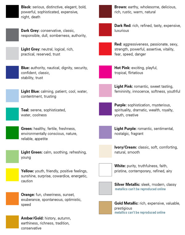
There are psychological and cultural meanings to colors. The general guidance around colors and their meaning can help validate your BRAND color selection or steer you in the right direction. I found this great color chart from Xtreme Brand Makeover (see below) and it is consistent with the general consensus on the meaning of color. For example, my BRAND colors are navy blue and hot pink. According to this color chart, blue represents authority, dignity, security, confident, classic, stability and trust. Hot pink represents exciting, playful, tropical and flirtatious. Those attributes are all consistent with the BRAND of Mitchell Productions Web Design and Social Media Coaching. I want my clients to feel “secure and confident” working with me and I want the process to be “exciting”. Is this an exact science? No! But again, I think the color chart gives some great guidance.
3) Your professional pictures should coordinate with your BRAND colors.
Your professional pictures play a huge role in your BRANDING because they are included in your website, social media profiles and print marketing. When preparing for a photo shoot, select outfits and backgrounds that compliment your BRAND colors. Ideally, you want some outfits that are in your BRAND colors. For example, one of my clients, Tonya Sloans, Esq. ( www.iampowerwoman.com) had a photo shoot and she wore a white dress, a red dress and a navy blue pant suit. Her BRAND colors are red and gold so all of her pictures compliment her BRAND.
4) Your website should compliment your BRAND colors.
As a web designer, I endeavor to bring your BRAND to life with a website. Your website is your communication hub and your 24 hour customer service and marketing center! Your website design should include your BRAND colors. Typically, your logo design and professional pictures are completed before your web design process starts. This will ensure that the web designer can coordinate your site to compliment your logo and pictures which are all in your BRAND colors.
5) Your social media presence should include your BRAND colors.
Whether you know it or not, many small businesses and new entrepreneurs are attracting their customers from Social Media sites such as Facebook, Twitter, Instagram and etc. Your BRAND colors should be very evident on your social media pages. Social Media should lead the potential client to your website or landing page and so that flow should be consistent for them. One way to do that is with consistent BRAND colors.
When designing your cover images, ensure that they are consistent with your BRANDcolors. The key to all of this is to help the potential customer experience your BRAND in a consistent way. For example, you don’t want your logo to be green and blue and then your website is orange and gold and then your Facebook cover image is black and yellow.
Conclusion
In conclusion, color is very important to your BRAND. BRANDING is largely about consistency and visibility. If you have been inconsistent with your BRAND colors, you can fix that! Just start from today and work on identifying your BRAND colors and updating your online and offline marketing to match those colors.
Schedule one on one coaching sessions with Sharvette to bring consistency to your BRAND through color! CLICK HERE.

Compliments of XtremeBrandMakeover.com
Greg Smith
0
